© Ujjawal Solanki | All Rights Reserved



I am Ujjawal Solanki, a dedicated software developer with expertise in full-stack development, React applications, and Node.js backend services. I create innovative, scalable, and user-friendly web applications.
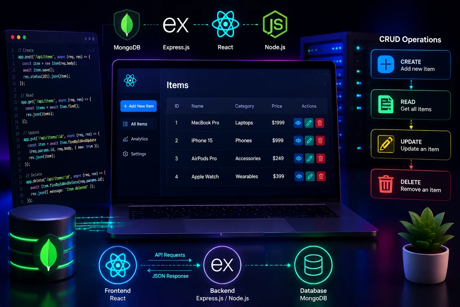
Tutorial CRUD teaches you the happy path. A form submits. A list updates. Everybody smiles. Real users arrive later and immediately test everything the tutorial skipped.
They submit blank values. They double-click the save button. They refresh during an edit. They delete the wrong item and expect mercy. That is when CRUD stops being a demo and becomes product design.
I learned this while building admin panels and small client tools. The code that looked perfectly fine in a YouTube walkthrough suddenly felt brittle once people depended on it.
I used to refresh the whole page after every create, update, or delete. It was a lazy shortcut dressed up as simplicity.
Loading states were inconsistent. Errors only appeared in the console. One component owned the list, another owned the form, and both thought they owned the truth.
CRUD quality is not measured by whether the request succeeds. It is measured by whether the user trusts what happened.
Now I treat each CRUD screen like a tiny workflow with emotional moments. Saving needs reassurance. Deleting needs confirmation. Empty data needs a clear state. Failure needs a human explanation.
That shift made the code cleaner because the UI finally had rules.
I pick one component or hook to own fetching for the screen. When five components fetch overlapping data, you get duplicate requests and stale state drama.
useEffect(() => {
  let ignore = false;

  async function loadItems() {
    setLoading(true);
    setError('');
    try {
      const res = await fetch('/api/items');
      const data = await res.json();
      if (!ignore) setItems(data.data || []);
    } catch {
      if (!ignore) setError('Could not load items.');
    } finally {
      if (!ignore) setLoading(false);
    }
  }

  loadItems();
  return () => { ignore = true; };
}, []);I used to rely on the backend alone. The result was a laggy user experience where obvious mistakes still triggered network requests.
Now the form checks required fields first, then the API validates again. Frontend validation improves feel. Backend validation protects truth.
if (!form.title.trim()) {
  setFormError('Title is required');
  return;
}

const res = await fetch('/api/items', {
  method: editingId ? 'PUT' : 'POST',
  headers: {
    'Content-Type': 'application/json',
    Authorization: `Bearer ${token}`
  },
  body: JSON.stringify(form)
});The most peaceful CRUD screens are the ones where state updates are boring and explicit. I either refetch on success or patch local state with the created or updated object.
What I avoid now is guessing. If the server is the source of truth, the UI should reflect that clearly.
const saved = await res.json();
setItems((prev) => {
  if (editingId) {
    return prev.map((item) => item._id === saved.data._id ? saved.data : item);
  }
  return [saved.data, ...prev];
});Delete is where trust disappears fastest. A tiny trash icon with no confirmation might feel sleek, but it creates anxiety the first time someone clicks it by mistake.
I confirm destructive actions, show progress, and remove the row only after the API returns success.
if (!window.confirm('Delete this item?')) return;

await fetch(`/api/items/${id}`, {
  method: 'DELETE',
  headers: { Authorization: `Bearer ${token}` }
});

setItems((prev) => prev.filter((item) => item._id !== id));A blank table can look broken if you do not explain it. A disabled button without context feels dead. Users should always know whether the app is waiting, failing, or simply empty.
This is where many CRUD tutorials stay too short. But in production, these states shape how professional the app feels.
Optimistic UI is great when the basics are solid. If the honest loading and error paths are weak, optimism just hides bugs for longer.
CRUD is not low-level work. It is the backbone of most business apps. If your CRUD feels calm, users trust the rest of the system faster.
The best compliment a CRUD screen can get is that nobody notices it. It simply feels reliable.
If this helped you, save it for later. And if you are stuck on a MERN feature, you can always reach out to me.
© Ujjawal Solanki | All Rights Reserved